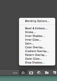
To edit my poster i used the ‘Fx’ button
The ‘R’ ‘G’ ‘B’ buttons were pressed so that the 3 different layers were made to be red green and blue

Another layer was added ‘Layer 7’, a filter was put on top of the pictures named ‘render’ and a cloud effect was used

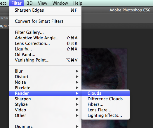
Here is the effect:
Another layer added

This time a different filter used, ‘Pixelate’ and the effect ‘Crystallise’ was put on top

Here is the effect:

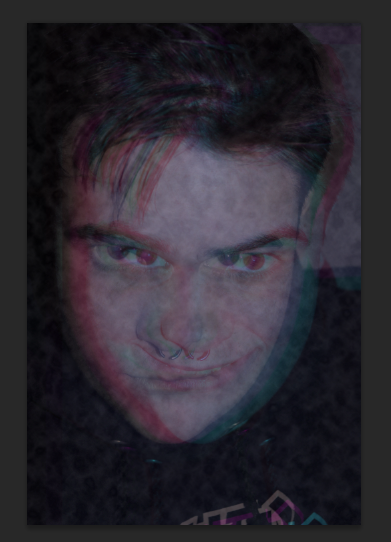
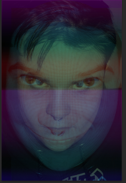
Another layer and another effect used to create a distorted ‘schizophrenic’ image
this image made one of the faces as a layer distorted and circular, now at this point in the poster, every layer and face is different representing the idea of a ‘schizophrenic mind’
Another filter used to add too the schizophrenic idea to the poster: ‘Liquify’
This affect distored the face even more, the brush was decreased in size and certain elements of the face were changed

As you can see the mouth has been widened and the eyes pulled closer together under the top layer:

These were my other ideas, and to do this I used the invert button to change the colours to the opposite spectrum of the the original picture


Finally I chose the origional image that I used, as the feedback I got on Facebook, the majority of people said that they liked my origional image the best: here is the link to the post: https://a2mediasarah.wordpress.com/2014/12/15/feedback-for-my-horror-poster/
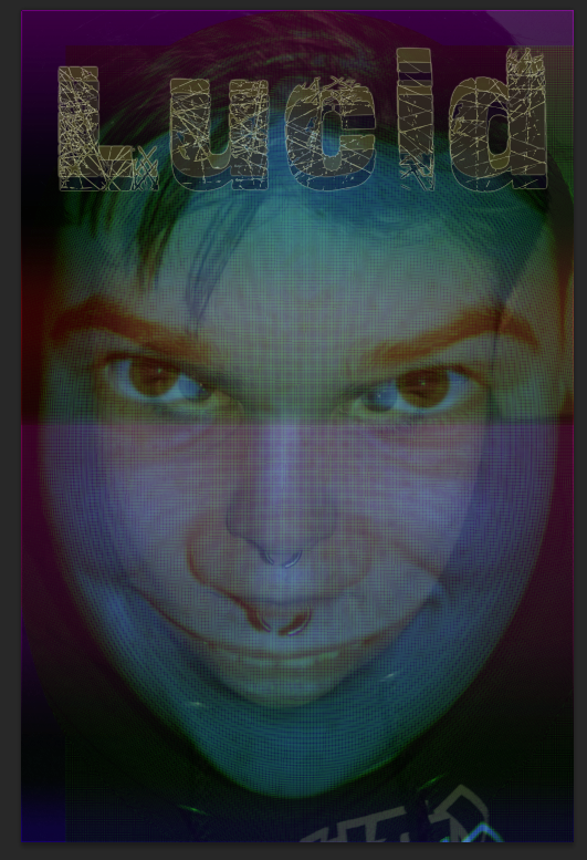
I have added my title to the poster of ‘Lucid’ by doing this I used ‘Da font’

By doing this I added another layer ontop of the poster (and named it lucid)
to sustain the trippy and schizophrenic look about my poster (as it reflects the idea of my film) I duplicated the layer and changed the font, and with the other titles, I turned the opacity down.


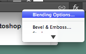
For every title name I used an effect called ‘outer glow’, this segregates the titles so that the audience can see the duplicated layers, this is important to me as it reinforces the idea of a ‘trippy’ look 
These are the different layers with the effect for an outer glow: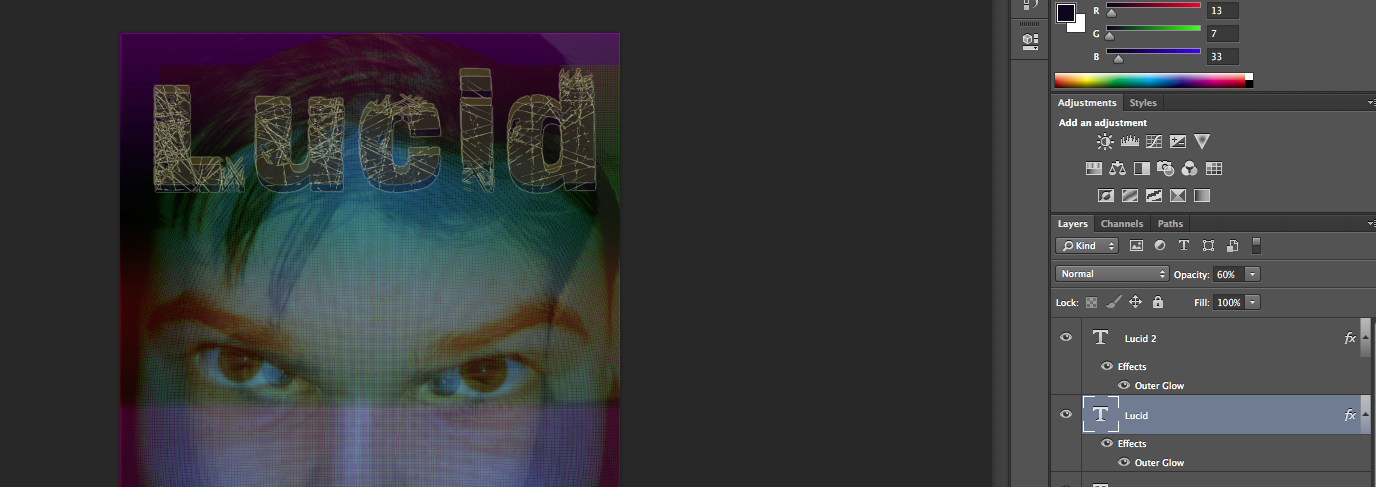
Here is the overal effect

[…] Please click on this link to show you my previous construction of my final version of my horror post… […]