Monthly Archives: January 2015

Break down of shooting my trailer

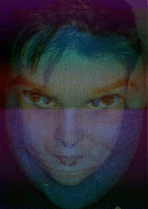
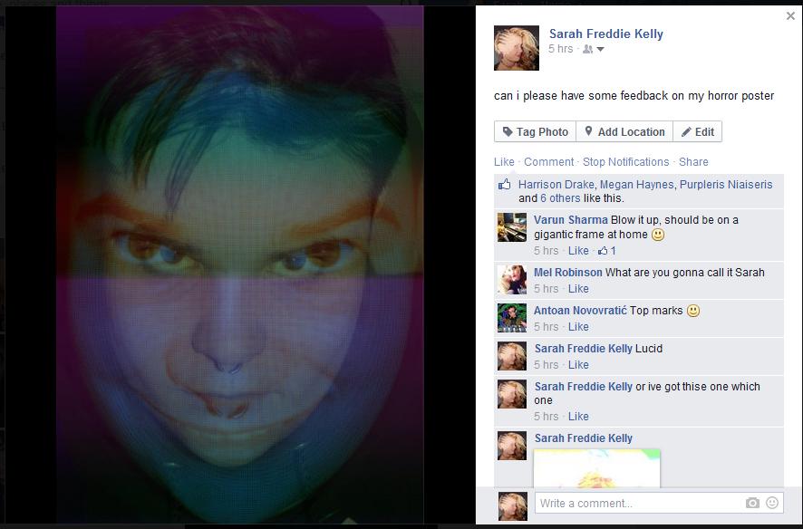
On the 9th of January i started the very scary task of actually filming my horror trailer… I started with the end of my trailer, as I am not 100% on what shots I should use to introduce Josh as a character I have started with my final couple of scenes. Here is the link to my storyboard for additional recollection:

Costume:

  • black jeans
  • t-shirt
  • trainers

Props

  • Window
  • Fake blood
  • Children’s toy

Locations needed

  • A house
  • A room with window
  • A long corridor
  • a woods -> Cornwall

Other characters needed

  • Josh
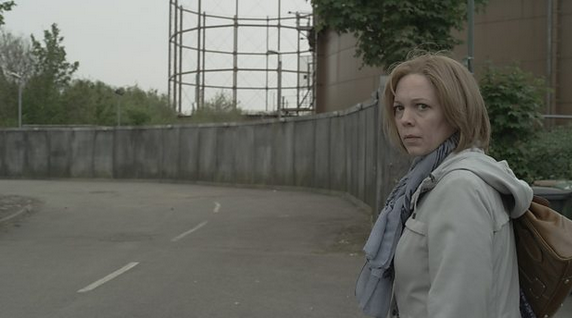
  • Person he kills (Me)

The first bits of shooting were dedicated to the last 3 pages of my storyboard… Preparing Josh (jack)… In order to make sure that Jack was in role of Josh I made him wear black trousers, black jeans and black trainers, once his costume was all set we left to go and shoot in the woods, the reasons for Josh wearing such normal clothes is because it shows the audience how ordinary people can look with schizophrenia thus creating more angst for the audience. DSC_0008 DSC_0011

Door scene: I used the front door window to use for the scene when Josh splatters blood on the door, this is because the window if kind of frosty looking, as I want Josh to uphold his secrecy throughout the whole trailer (as stated in the story board) I made sure that you could only see his eyes. This scene is important as it builds up tension showing the audience that Josh is clearly not OK, along with the foreshadow of the bell ringing, Josh will then have a psychotic episode and this will be shown through his face in the window. To build the tension even further I followed Josh towards the door slowly moving the camera into a closeup shot of Josh’s face. One of the hardest things to do was to hold the camera still whilst walking, however this also be used to add tension to the trailer because its as though the camera is from another characters point of view. DSC_0024

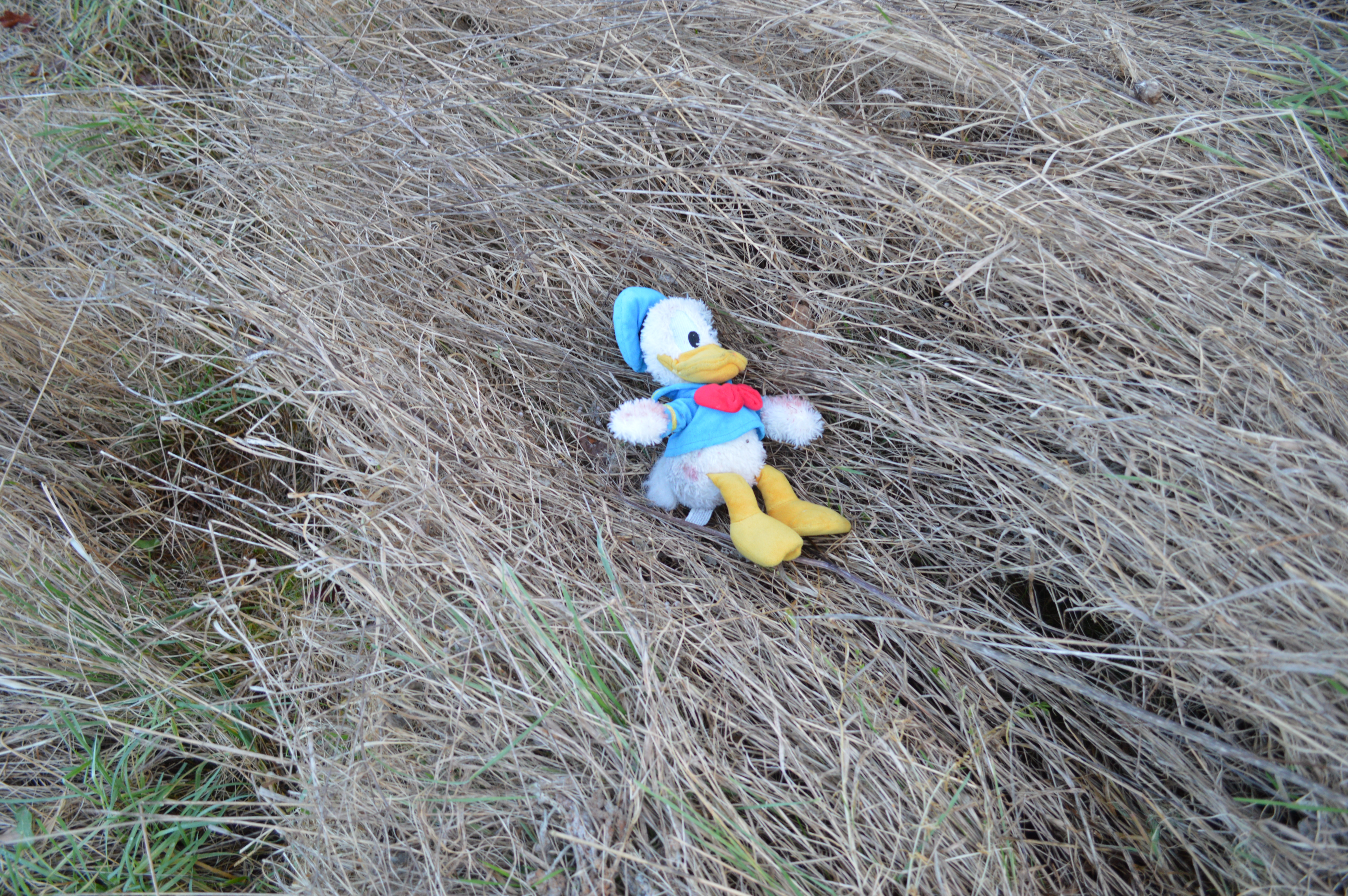
The path scene: As I followed Josh up the path, he holds a child’s toy, the problem I found with this was that it was hard to get the toy on show, in order to stop this problem, when I followed Josh up the path with the toy I made him drop the toy and moved the camera with the toy directly in front of the camera and in the background Josh running away. However  I shot this in portrait view therefore I am going to have to re-shoot the scene to make it into landscape view. This scene is important to execute it properly because it shows Josh as a vulnerable character (especially as he runs away), making sure that the audience are getting fully involved in Josh’s life. When I got the toy in focus, I used an extreme close up showing the blood on the toy, I want the audience to be able to see what he was holding as it is a representation of Josh’s psychosis.

DSC_0028

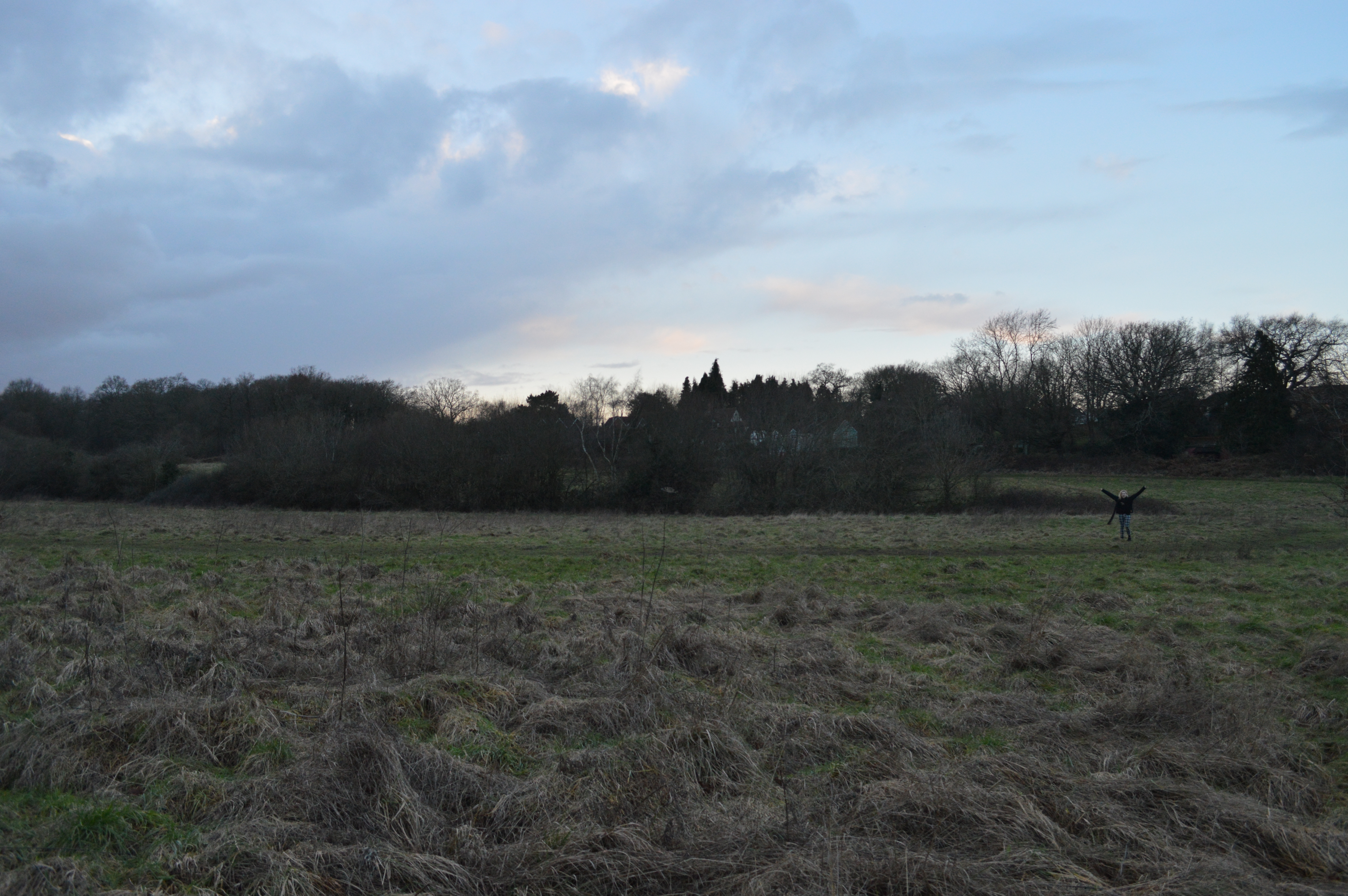
Following Josh into the woods scene: Before being shocked by Josh’s presence in the woods I shot some footage of the surrounding scenery, a pan shot is done allowing the audience to establish the bearings before meeting Josh, a noise is made and I say ‘hello, hello, hello’ I am shocked, the camera stops on Josh, the pan is necessary as it builds up tension for when the audience finally meet Josh face to face.

Josh’s first killing scene: To show Josh’s destruction I have included a bit into a scene, to make sure that I could be involved as a character I laid the camera in the grass (this was definitely  an experiment), the scene shows Josh running away from something  through the woods though you cannot see his face yet. A low angle was used to view Josh, this was to make his character look more powerful to the audience and to scare them even more. After he is out of shot a girl drops dead in front of the camera, staring at the camera with a trickle of blood oozing out of her mouth, this makes the audience feel vulnerable and small by looking up at the character.

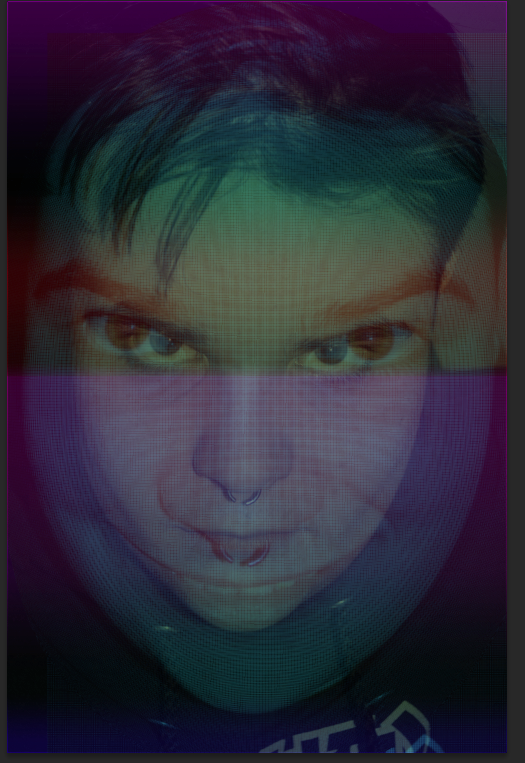
Finally seeing Josh face to face scene: An establishing shot is used here to again build up tension, Josh walks closer and closer to the camera. This builds tension because as he gets closer the audience are also getting closer to meeting the real monster behind all the destruction. And as he gets to the camera a close-up shot shows Josh’s face finally, and as he is at the camera he says ‘Where am I’, knocking on the glass of the camera. This makes the audience think that Josh’s reality is so distorted he doesn’t know what is what. (A camera to a door), and this therefore shows his overall confusion on whats gone on thus showing the audience that he has gone crazy…. and telling us that Josh doesn’t know what reality is.

Other pictures taken on the first day of shooting :

DSC_0048 DSC_0002

On the 16th of January the shooting continued!

Pictures taken today:

DSC_0097

The path scene (x2): As I said before, I recorded some of my footage in portrait therefore I had to redo some scenes from the story board and film them in landscape this time.

Screen Shot 2015-01-16 at 19.39.35 Screen Shot 2015-01-16 at 19.48.10 DSC_0062

Added snippets: As I had some inspiration from the location I shot a little extra footage rather than sticking to the origional story board I may add in a bit more footage of Josh’s psychotic journey, otherwise the trailer may not make sense, to add even more tension to the origional scenes I recorded some footage of the toy (Donald Duck) using close up shots of it. This may not be added into my final trailer but there is no harm in having more footage than needed. DSC_0110 DSC_0172 DSC_0141

On the 24th of January I continued shooting. As my original storyboard ended up being too minimal, there wasn’t enough material for me to create a trailer therefore I had to add in extra scenes. This is because I need the audience to build a relationship with Josh before the horror happens, as this makes the overall horror trailer more realistic. The clips that I had up until this point were too long and were not very explanatory of Josh as a character therefore I did some shooting of Josh in his normal habitat (in his room) – waking up, getting ready for school, making coffee to show the audience that Josh is normal. Adding in these scenes were absolutely necessary because a relationship with the audience needs to be created in order to highlight Josh’s psychosis even more and perhaps for the audience to be drawn into how normal Josh can be perceived.

Added props, costumes and locations: Props:

  • A messy bedroom
  • A bed
  • A bed cover
  • An alarm clock
  • A light switch
  • A coffee mug with toy story on it (to show Josh’s vulnerability)
  • A kettle
  • A mirror

Costume:

  • Socks (shows that Josh puts the socks on in the original clip)
  • Shoes (tying shoe laces)

Location:

  • A bedroom
  • A kitchen
  • A house

Added scenes:

  • Josh waked up, gets ready for school
  • Josh sees things in the mirror
  • Josh and Sarah meet, they talk.

Screen Shot 2015-02-06 at 20.57.33

In this added scene I have included a close up shot of Josh’s feet, this is to add tension and to increase the atmosphere and horror element of my trailer. Originally the proceeding scenes were filmed in the light, this was changed after realising  that he was about to wake up… It just made more sense. Furthermore, the darkness of the scenes following increase the realistic element of my trailer, especially when Josh turns the light on its made clear to the audience as an extreme close up shot has been used. The fact that Josh is also sleeping and the camera shows just his feet adds tension and vulnerability to Josh because he has no power. The camera also looks as though someone is watching Josh sleep (this will add to the idea of a psychological horror as it may show the audience that Josh is psychotic.)

Screen Shot 2015-02-06 at 20.57.45

Secondly, this shot is a close up of Josh turning the light on, this again represents Josh’s normal personality. The short snippets of film building up to the main bit of the trailer includes this scene of Josh turning the light on, this again increases tension for the audience as at the beinning of the trailer the audience have no idea what sort of character they about to meet because he hasn’t been on camera yet.

Screen Shot 2015-02-06 at 20.58.13

In this scene it shows a close up shot of Josh turning the kettle on, because I wanted to add scenes in at the beginning of Josh in a more of a normal environment so the psychosis of Josh builds up throughout the trailer, the short scenes at the beginning of my trailer are necessary in increasing the tension for the audience. Furthermore the diagetic sound of the kettle boiling and the button popping signifying the water has finished boiling, increases the tension even further, this is because any noise could be unsettling for the audience to endure at the beginning of my trailer as not horror has yet been shown in my trailer.

Screen Shot 2015-02-06 at 20.58.27

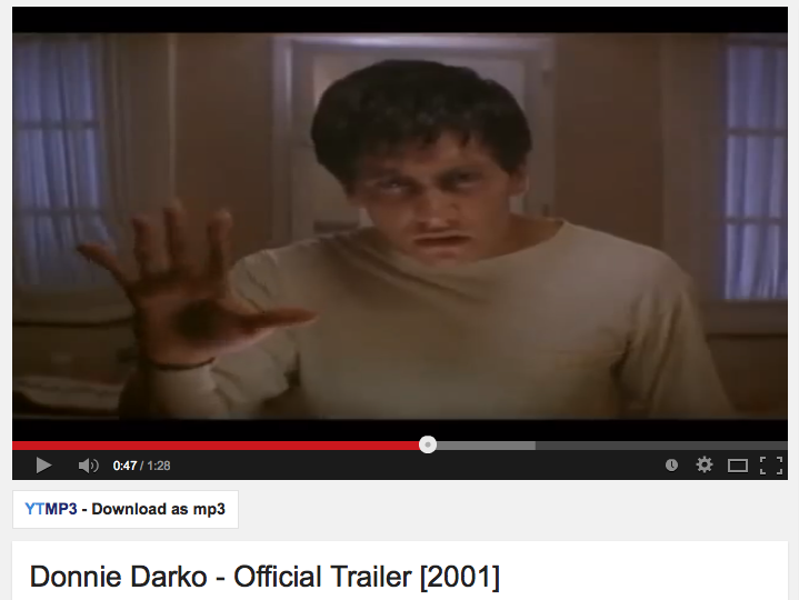
The finally added scene was off Josh in the mirror, as the mise-en-scene use of a mirror is one of the biggest conventions of a horror trailer, i thought this would be a perfect opportunity to build tension and anx for my trailer (this was inspired by the film Donny Darko). This scene is when the psychological horror creeps in and it is an extremely pivotal scene for my trailer as it starts to shows Josh’s psychosis. He believes that there is someone staring at him through the mirror.

Extended research for my poster

I typed into google images ‘paintings of schizophrenia’ and here is what came up:

B0006148 Privacy

s 1

schi2

schizophrenia_painting_by_goodgirl94-d4uml5u

4ftrerdfe

ASIafdfds

images

coverfig

From this research I can see that most paintings/pictures show two faces,

The literal definition of schizophrenia is :

‘a psychotic disorder characterized by loss of contact with the environment, by noticeable deterioration in the level of functioning in everyday life, and by disintegration of personality expressed as disorder of feeling, thought (as delusions), perception (as hallucinations), and behavior —called also dementia praecox
These paintings confirm the different personalities that someone can have with schizophrenia, the different faces highlight this even further, therefore…
In my production piece I have made sure that different pictures of Jack pulling different faces represent the alternative personalities that someone with schizophrenia has; therefore in my horror trailer, the different faces will represent the personalities that Josh has in the poster… All in all, showing the audiences the beginning of Josh’s schizophrenic journey that is about to be unraveled in LUCID.
By doing this I was able to add the different photos in photoshop, and layering them on top of one another. In order to show the different faces that he is pulling, the opacity is turned down for every single picture, to show the obscurity within a schizophrenic mind, I have used different filters and colours to represent this.

Changes made to my drafted storyboard…

  • As my original storyboard idea may be a bit minimal as far as the camera editing, I have taken some pictures of locations that I am going to use and drawn on the pictures to describe the movement of Josh, I have also taken some pictures of the scenes where Josh will show himself in a normal light

First storyboard ideas:

img001

img002

Second storyboard ideas:

storyboard-page-001

storyboard-page-002

storyboard-page-003

storyboard-page-004

  • On reflection, the original story board that I came up with was not enough, after asking people in my class about the ideas of my first draft of my story board, they said ‘the audience needs to get to know Josh a bit better, so if you show the audience a bit about what he does in the morning in a more normal environment, the contrasting of the normal environment will really juxtapose with the any abnormal psychotic scenes shown later on in the trailer.
  • I am also considering changing around a few scenes as the original story board does not make enough sense, as it needs a bit more detail on Josh’s life and psychosis…

Final storyboard ideas:

Here are my progressed and changed ideas….

When Josh is normal and when the audience get to know Josh a bit more (These scenes will be added into my trailer:):

Josh get out of bed alarm clock

alarm clock presed

kettle turned on

Josh cycling

When Josh’s psychosis comes out, these scenes will be juxtaposed against the scenes of Josh’s normal day to day routines:

sarah follows josh intow woods

Josh runs through woods

josh walks towards camera

psychosis turns

bloody toy

Josh watching tree

Planning & Choosing my Film institution

The importance of film distribution:
  • Choosing the right film distributor is really important as the reputation that the film distributor has with its previously distributed films will have effect on other films being distributed.
  • The more copies of the film that can be made from the distributor the reputation of the distributing company will be better
  • However, it is shown that the less successful films are distributed by independent distributors because these companies are limited to the amount of money that they have with campaigning, advertising and promoting the film.
  • It is also important to choose the correct film distributor correlating to the nature of your film as it would be a bit obscure if you chose to have a major film distributor back your alternative film.
  • This will therefore be something that I will take into consideration when choosing my Film distributor for LUCID.
In order to decide what film distributor is the best for my specific film I have done some research on both independent and major film distributors.
Independent Film Distributors:
I have looked at certain independent film institutions that are based in the Uk, because most other independant film institutions are based in the USA, but seen as my film has been planned, made and campaigned in the Uk, doing research in the uk is more important and suited to my film.
Here is what I have found:
Screen Shot 2015-03-01 at 11.34.18
Independent specializes in the development, financing, production and distribution of independent feature films. Led by CEO Luc Roeg, who has over twenty years experience in the film business, Independent has a team of highly motivated and experienced professionals with expertise in project development, production, structured finance, distribution, sales and marketing.
The first independent distributor that I found was actually named: the independent film company
  • The Sea

Based on the Booker Prize-winning novel by John Banville.

The Sea
After the death of his wife, Max Morden retreats to a house by the Irish sea where he spent his childhood summers. Re-acquainting himself with places past brings back powerful memories from one fateful summer many years ago. Only an unforeseen revelation will provide a path to closure and redemption.
  • The Information

The Information

Powerful and psychological story that examines the minutiae of relationships in the most extraordinary of circumstances: two undercover police officers posing as a couple, living together in the middle of a massive crime-ridden tower block. Meanwhile their own partners are left sitting on the sidelines, awaiting discreet telephone calls, and stolen moments. We all occasionally take our work home with us, but what happens when work becomes our new home? How do you live as a believable couple when you are not one… and never make a mistake?

Screen Shot 2015-03-01 at 11.31.00

Film4 Productions is a British film production company owned by the Channel Four Television Corporation. Before 1998 Film4 Productions was known as Channel Four Films or FilmFour International. In 2006 the name Film4 Productions was introduced.

Another quite famous independent film distributor is ‘Film 4’

  • The Inbetweeners film 2
  • Macbeth
  • Carol

Another independent film distributor is ‘BBC FIlms’

Screen Shot 2015-03-01 at 11.35.38

BBC Films is the film making arm of the BBC which has been responsible for co-producing some of the most successful British films in recent times. Until 2007 BBC Films was located in Mortimer Street, London, UK but now BBC Films is based at the BBC Television Centre, London, UK.

In cinemas now:

Upcoming films:

  • Man Up

Screen Shot 2015-03-01 at 11.53.43

  • London Road

Screen Shot 2015-03-01 at 11.54.35

Warp Studios and FIlm 4 often combine when financing a film…

The final independent film distributor that I have researched is ‘Warp’:

Screen Shot 2015-03-01 at 12.52.23

Warp, commonly referred to as Warp Records, is an independent British record label, founded in Sheffield in 1989, specialising in electronic music. Warp Films is one of the UK’s most critically acclaimed independent Film and TV production companies and is based in Sheffield & London, UK.

  • ’71’
  • Four Lions

Here’s a compilation an snippets of films distributed by Warp Studios that I found on youtube:

<iframe width=”560″ height=”315″ src=”https://www.youtube.com/embed/GQtvw_01nQM&#8221; frameborder=”0″ allowfullscreen></iframe

Mainstream Film Distributors:

I will be researching Columbia Pictures, Paramount Pictures, MTV films and Happy Madison Productions 2005, here is a video of what there logos are.  This is often featured at the beginning of major distributed films:

1st major film distributor: Columbia Pictures (Sony pictures)

Screen Shot 2015-03-01 at 12.55.16

Columbia Pictures Industries, Inc. (CPII) is an American film production and distribution studio of the Columbia TriStar Motion Picture Group, a division of Sony Pictures Entertainment, a subsidiary of the Japanese conglomerate Sony.[1] It is one of the leading film studios in the world, a member of the so-called Big Six. It was one of the so-called Little Three among the eight major film studios of Hollywood’s Golden Age.

Click on this link to show you a poll made by Columbia Pictures to show you peoples opinions on what was the best distributed film by Columbia Pictures

From this website it says:

1) Groundhog Day

2) The Shawshank Redemption
3) Misery
Paramount Pictures Corporation (commonly known as Paramount Pictures or simply Paramount, and formerly known as Famous Players-Lasky Corporation) is a film studio, television production company and motion picture distributor, consistently ranked as one of the “Big Six” film studios of Hollywood. It is a subsidiary of US media conglomerate Viacom.
Screen Shot 2015-03-01 at 12.53.05
Top 3 films distributred by Paramount Pictures:
source of reference: IMDB
1) Titanic
2) Transformers Dark of the moon 3
3) Transformers: Age of Extinction
MTV Films is the American motion picture production arm of the cable channel MTV. Founded in 1996, it has produced films based on MTV programs such as Beavis and Butt-head Do America and Jackass: The Movie, as well as other adaptations and original projects. Its films are released by fellow Viacom division Paramount Pictures.
Screen Shot 2015-03-01 at 12.59.14
  •  Jackass Presents: Bad Grandpa
  • Blades of Glory
  • Justin Bieber, Never say Never
Screen Shot 2015-03-01 at 13.11.58
Happy Madison Productions is an American film and television production company founded in 1999 by Adam Sandler who is best known for his comedy films. Happy Madison takes its name from the films Happy Gilmore and Billy Madison, two box office successes starring Sandler himself, both produced by Robert Simonds. The elderly man depicted in the logo is Sandler’s late father, Stanley.
  • Zookeeper

After taking into account of both Mainstream and Independent distributors I think that best distributor for Lucid would be and Independent distributor so Warp Studios or Film 4. I believe that having an independent distributor will allow me to have more scope and choice in how I want my film to be. Although the budget will be minimal, I will not need much money as I’ve used local locations and my own idea for the making of LUCID.  Big successful independent films are rare however, there have been successful independent films in the past:

Click on this link: and it will show you the top ten indies at the box office.

When researching warp studios I watched some of the films and how they were produced, this is appealing to me because the aesthetics of some films will be similar to my film; LUCID

Horror film trailer analysis

I have chosen to do the genre Psychological Horror and I have analysied films that indicate psychology as this will specifically help me with creating my trailer more than a for example a ‘Slasher’ horror trailer would.

These types of films feature a disturbed individual whose mental problems unnerve and frighten audiences. The ‘psycho’ will appear like a ‘normal’ human-being, before revealing their monstrous and sadistic nature. There is less need for masses of death, violence and gore as they scare audiences by reminding them of reality. Psychological horrors give the impression that we may be living amongst danger.

As I’ve chosen this genre it would be easier to film because it involves less violence and gore. This could possibly mean that my film trailer would have more chance of appearing professional. Conventionally, there is a clever and complex storyline attached to psychological horrors and it would be intriguing to construct a plot so in-depth and intricate. However, it would be challenging in the sense of producing an authentic storyline for this genre. As I have been able to develop a good enough storyline around the idea of a psychological horror I have used certain trailers to help me understand how I can make this genre scary in a trailer.
What is a psychological horror?
Psychological horror is a sub-genre of horror fiction, film, and video games (as a narrative) which relies on the characters’ fears and emotional instability to build tension.

Donnie Darko (2002) Analysis:

The film is a massive inspiration for me  The ideas of the hallucinations initiated further ideas and also the the horror posters and the different pictures involved in this film added to my palette of knowledge for my trailer too.

I will be analysing three different trailers that are similar to my ideas, this will be a part of my primary research as it will provide me with some inspiration for when I start shooting my own trailer.

Synopsis: A troubled teenager is plagued by visions of a large bunny rabbit that manipulates him to commit a series of crimes, after narrowly escaping a bizarre accident.

  • Although Donnie Darko is not explicitly a horror film I feel as though it has been the most inspiration for my ideas other than the normal slasher horror films. The film does include elements of horror and it certainly scared me, but the reason for analysing this trailer because it holds a psychological element of the film therefore it is extremely relevant to the research for my horror trailer.
    Screen Shot 2015-01-05 at 10.22.55

Analysis:

  • Before the trailer starts a green screen picture comes and and says ‘Restricted’ and suggests that those who are under the age of 17 should be accompanied by an adult. immediately this green image implies that the content of the film is going to be scary/ grusome/ rude.

Screen Shot 2015-01-17 at 21.37.46

  • As the trailer continues, the difference between the diagetic sound and non diagetic sound is apparent to me when. When Donnie has the hallucinations, the non-diagetic hallucinatory sounds highlight his psychosis even further. The diegetic sounds includes Donnie’s conversations with the characters who are also involved in the film. At the beginning, it shows that he is a normal/ perhaps stable teenager, even though he is not. As the trailer moves on, sounds are fitted over the top to signify the change in Donnie’s perception. The sound over the top of Donnie’s hallucinations really imply that something is going to happen. Obviously the audience do not understand or know what it is as the movie has to be watched however, when this is shown a psychological aspect of the film is certainly portrayed to the audience. The sounds as well as his psychosis increases the tension of whats to come next.

Screen Shot 2015-01-17 at 21.44.53

  • After this bit of the trailer, we can see that when Donnie has his hallucinations he sees something wearing a mask named ‘Frank’, he is the villain in Donnie’s head and this is reinforced through the character wearing the mask; this is scary. Masks distort the wearer’s appearance, causing him to look strange and unusual. Most masks do not feature moving mouths, so when Frank speaks the sound appears to come out of nowhere putting the watcher in the same position as the character in the film.

Why are masks scary:

Maskaphobia is believed to be related to automatonophobia, or fear of humanoid figures . A precise cause has not been determined. Nonetheless, a common theory states that these phobias may be rooted in our expectations of human appearance and behavior.

The Mise-en scene used here is the costume, as we see the image of Frank, he is staring back at us, Frank is a representation of Donnie’s psychosis, as it shows the audience his hallucination, the lighting also used along with the prop of Franks mask. The lighting is dark showing that Frank is a dark concept and as a result triggering the audiences imagination. This is how props and lighting have been used to increase effect and tension; ultimately what the director wants to do to. This definitely suggests Donnie’s psychosis, once again reinforcing the psycho-horror element of the trailer.

Screen Shot 2015-01-17 at 21.54.32

  • As the trailer ends it shows flashing images of him vs Franks; normal vs psychosis. A purple filter has been put over the top of the flashing images, purple symbolizes power. Purple is  associated with , independence, creativity, mystery, and magic, all of this subconsciously understand his omniscience. The fact that a filter can really change how someone looks at something will really help me when I am conveying certain messages in my horror trailer. The camera angle in this scene is looking straight at Donnie Darko suggesting that he has a lot of power. This creates the atmosphere of suspense for the viewer making them want to watch on to find out what happens next.

Screen Shot 2015-01-17 at 22.10.29

The Fight Club (horror trailer)

Synopsis: An insomniac office worker looking for a way to change his life crosses paths with a devil-may-care soap maker and they form an underground fight club that evolves into something much, much more..

Analysis:

  • Firstly I noticed that in a specific shot of Tyler in this scene, when he is asleep a black and white filter has been used, it then changes to a normal filter. The filters suggest that Tyler has two sides to his personality, the idea of a duality in character or personality reveals his psychotic tendencies, portraying to the audience that he is a danger as he is not completely himself all the time. This effect will be something that I will speculate on using in my horror trailer as it is a simple yet effective way of showing the audience that Josh has different personalities which reinforces the idea of it being a psychological horror trailer.

Screen Shot 2015-01-17 at 22.20.03Screen Shot 2015-01-17 at 22.20.12

  • The sound of the characters monologue almost reveals what goes on inside his head, later on scarier music is used over the clips chosen to portray the scary aspect of psychosis. The ring of the telephone signifies how the character has no control over what goes on his head, and as this is not possible, it implies that he is having and auditory hallucination. This had made me realise how important sound is, not just diegetic sound but non-diegetic sound too. This sound increases the atmospheric aspect of the trailer and leaves the audience  intrigued into what is next to come. This gave me a few ideas for my trailer as its really important for me to show the psychosis of Josh (but not too much) as I need to be able to leave the audience wanting more. Curiosity is key. (Bathes enigma code)

Screen Shot 2015-01-17 at 22.22.07Screen Shot 2015-01-17 at 22.25.17

  • In this part of the trailer the camera angle is looking up to the character, showing his superiority, this increases the tension involved as it makes the audience feel on edge about the characters capabilities. I will also consider the different camera angles to use in my trailer.

Screen Shot 2015-01-17 at 22.25.03

Shutter Island

Synopsis: In 1954, U.S. Marshal Teddy Daniels is investigating the disappearance of a murderess who escaped from a hospital for the criminally insane and is presumed to be hiding near-by.

Analysis:

  • In this part of the trailer, the lighting it shining onto the character emphasising the characters omniscience. This increases the character likeability factor as the lighting is pointing down onto him making him look vulnerable and scared. As there is a low level of lighting projecting onto the character, this makes the character look mysterious… again reinforcing the idea of a psychological thriller, as it can emphasis the enigma codes within the film trailer, which makes the audience want to watch the actual film. It is a good strategy to lure the audience and one that I will experiment with in my own horror trailer.

Screen Shot 2015-01-18 at 13.37.13Screen Shot 2015-01-18 at 13.39.59

  • The setting of the horror film is based around a mental institute and therefore the use of characters and narrative and slow track editing of this psychotic woman reinforces the conventions of a psychological horror. This woman gives an insight into what the mental institute is like which foreshadows to how scary the actual horror film is going to be.

Screen Shot 2015-01-18 at 13.37.35Screen Shot 2015-01-18 at 13.41.06

  • Another convention of a psychological horror trailer through the use of editing. This trailer uses Bathes hermeneutic code is the use of flashback, this inevitably builds necessary tension and makes the audience question what is actually going to happen at the end of the film… therefore it subconsciously reals them in to make them watch the actual film. Th
  • When authors employ flashback as a literary device, they break with the traditional, chronological storytelling narrative. Therefore, when the flashback is included, it will likely bring information that had not been produced previously. There will be new details and facts that may help tie in the events taking place as part of the plot.
  • Flashbacks can be included as a break in the narrative, or blended within the story of the characters as it happens in the style known as “stream of consciousness”. In this type of story, the narrator is the main character, and is in constant analysis of a situation speaking from his or her own point of view and using first person.
  • Flashbacks can also come as dreams and memories, thus manifesting to the main character subconsciously. Whichever way they occur, their purpose is to add information, clarify issues, and perhaps be the solution to the story’s problem or main dilemma. Flashbacks are predominately found in psychological horrors, therefore I will make sure that this will definitely be something that speculate on when creating and involved in the post-production stages of my horror trailer (the editing part)

Screen Shot 2015-01-18 at 13.38.11Screen Shot 2015-01-18 at 13.40.19Screen Shot 2015-01-18 at 13.39.40

  • Further conventions are revealed in this physiological horror to dictate it being a horror genre is the use of props again, specifically; blood. As the trailer also shows the main character have flashbacks of a woman, this tells more about the narrative of the story and as a result definitely categories this trailer as a psychological horror. As one of the main conventions of a horror film is the use of blood because it implies death and killing, I will make sure that my own includes bloods it is one of the definite conventions that indicate to the audience that my trailer will be a horror. However, Shutter Island is a psychological horror and I noticed that the use of blood was not excessive and did not show explicit clips of a lot of blood therefore I will make sure that when I make my psychological horror trailer that I will not go over board with the blood.
  • Further conventions of a horror trailer are revealed in this part as the use of props (mise-en-scene) are shown. This makes it more scary for the audience. In order for the audience to want to watch the actual film, shots of the props in the mental hospital will increase the chances of a bigger audience for the horror film. I will make sure that I take this into consideration for my horror trailer as these props definitely fit into the convention of a psychological horror trailer , thus this will help me when i create my own horror trailer. Other props were used in this horror trailer such as a pen an piece of paper, which the word ‘run’ written on it, this again is the use of Barthes hermeneutic code as it avoids revealing the truth of the story all at one time and instead drops little fact, therefore I will certainly make sure that I use this technique in my trailer as it will engage the audience even more for my actual horror film

Continuing the construction of the final version of my horror poster

Please click on this link to show you my previous construction of my final version of my horror poster so it will make it easier to see how I have come up with my final product

Following on from that here is the final stages of the construction of my horror poster:

Screen Shot 2015-03-04 at 14.08.57Screen Shot 2015-03-04 at 14.10.01Screen Shot 2015-03-04 at 14.09.28

  • Firstly I have  added the name of my horror trailer onto the poster called ‘LUCID’ in the font of ‘Cf Anarchy’
  • A text box was drawn
  • I used http://www.dafont.com to help me choose which font was best fit for my horror poster
  • After much deliberation, CF Anarchy was the best choice.
  • I have made the ID a bit bitter than the rest of the title as this will refer to my previous research of Freud and ‘the id’ (click on this link to show you the research)

Screen Shot 2015-03-04 at 14.09.39Screen Shot 2015-03-04 at 14.09.23Screen Shot 2015-03-04 at 14.10.42

  • Next I have used a different font called  and written ‘The nightmare that never sleeps‘ which a allows the audience to immediately understand that its a psychological horror, the slogan of the poster draws the audience in so that they will want to watch my horror movie more
  • A line has been drawn underneath the slogan of my film to emphasise its importance and to also aesthetically separate the different components of my poster.

Screen Shot 2015-03-04 at 14.09.28

  • A text box was drawn and the size was adjusted to fit the poster best, this was the button that I pressed in Photoshop.

Screen Shot 2015-03-04 at 14.10.27Screen Shot 2015-03-04 at 14.09.28Screen Shot 2015-03-04 at 14.11.43Screen Shot 2015-03-04 at 14.10.37

  • Next the star of the film of ‘Jack Jordan’ has been features at the top of my poster using a different font which fitted in well with the rest of the poster, I used for this particular text
  • Two circular shapes were drawn and placed besides the featured name. I did this to make the name stand out more so that the audience were able to see that he is a good actor… ect,
  • This feature is also a convention that is on most horror posters therefore I thought it was imperative to add this to mine to ultimately make it look more realistic.
  • It also makes the text match the rest of my poster, this is important as the aesthetics need to fit in with a psychological horror theme.

Screen Shot 2015-03-04 at 14.26.01

  • The only font colour that is different to the rest is the ‘ID’ this is because its a very important aspect of my overall horror idea, as the ID symbolises that Josh (Jack) has an alter-ego in the film and again foreshadows about the later events occurring in my trailer and horror film.
  • The ID also represents that Josh has an identity and that its identity is all about a person… as my trailer is all about Josh as a person, this links in and relates well to him.
  • The red font colour also signifies and foreshadows that their is blood involved in the trailer and film… again linking to the ‘horror genre’
  • This, I found is a very important convention of a horror poster, therefore it was important to use it in the making of my poster.

Screen Shot 2015-03-04 at 14.29.55Screen Shot 2015-03-04 at 14.09.28Screen Shot 2015-03-04 at 14.09.39

  • ‘The best psychological horror’ has been added to the poster, this is because it is another convention of a horror poster that needs to be done, also it adds to the promotion and likeability factor of my trailer.
  • A text box was drawn
  • The font of Orator STD was used to make the poster loo even more fitting with the rest of it.
  • And to add more impact and conventions to my poster the stars have been changed to red to match the ID, these are the two main elements of my poster, therefore the font colour of red makes them stand out even more.
  • I did this by selecting the text that wanted to be changed to red and then chose the colour ‘red’ on the colour reel.
  • A stroke was added around, the text was highlighted the ‘fx’ button was added and then the stroke option was cliced on and then the width of the stroe was increased to around 3mm
  • ‘The Guardian’ to show the audience that it has had good reviews and promotion which will ultimately make the audience want to watch my horror movie more

Screen Shot 2015-03-12 at 17.31.14Screen Shot 2015-03-04 at 14.10.01

  • Finally, the ‘coming soon’ stamp was added to the poster to indicate to the audience that the movie is coming soon
  • This also adds impact and excitement for the audience knowing that the movie will be coming soon.
  • The same text as the title was used ‘CF Anarchy’ and the size changed
  • It was then placed in the right bottom hand corner of my poster so that its not completely in the way of the picture.
  • This is so that the main picture is not covered by text as it is really important for the audience to be able to have eye contact with the main protagonist in the movie, therefore all the text has been placed around the picture and eyes.

Here is my final version of my horror poster:

Screen Shot 2015-03-04 at 15.39.16

Freud – The ‘ID’

Screen Shot 2015-03-04 at 15.36.27

The id demands immediate satisfaction and when this happens we experience pleasure, when it is denied we experience ‘unpleasure’ or pain. The id is not affected by reality, logic or the everyday world.

On the contrary, it operates on the pleasure principle (Freud, 1920) which is the idea that every wishful impulse should be satisfied immediately, regardless of the consequences.

The id engages in primary process thinking, which is primitive illogical, irrational, and fantasy oriented.

Draft of my Horror Poster

After creating the image I started putting the text on the poster, however, as I was just playing around to see what fonts worked best with my horror poster, I have decided that his version of my poster will be a draft:

Screen Shot 2014-12-15 at 10.28.32

The reason why I feel that this is not the appropriate font is because it does not fit in with the genre of a psychological horror, therefore I have made changes to my original poster.

Construction of my horror poster… continued

To edit my poster i used the ‘Fx’ button

Screen Shot 2015-01-05 at 09.50.12
Screen Shot 2014-12-08 at 10.30.36

The ‘R’ ‘G’ ‘B’ buttons were pressed so that the 3 different layers were made to be red green and blue

Screen Shot 2015-01-05 at 09.51.16

Another layer was added ‘Layer 7’, a filter was put on top of the pictures named ‘render’ and a cloud effect was used

Screen Shot 2014-12-08 at 10.37.44

Screen Shot 2014-12-08 at 10.37.51

Here is the effect:

Screen Shot 2014-12-08 at 10.39.13

Another layer added

Screen Shot 2014-12-08 at 10.39.22

This time a different filter used, ‘Pixelate’ and the effect ‘Crystallise’ was put on top

Screen Shot 2014-12-08 at 10.39.44

Here is the effect:

Screen Shot 2014-12-08 at 10.41.30

Another layer and another effect used to create a distorted ‘schizophrenic’ image

Screen Shot 2015-01-05 at 09.57.57

this image made one of the faces as a layer distorted and circular, now at this point in the poster, every layer and face is different representing the idea of a ‘schizophrenic mind’

Screen Shot 2014-12-15 at 09.42.52

Another filter used to add too the schizophrenic idea to the poster: ‘Liquify’

Screen Shot 2015-01-05 at 10.00.03

This affect distored the face even more, the brush was decreased in size and certain elements of the face were changed
Screen Shot 2015-01-05 at 10.00.14

As you can see the mouth has been widened and the eyes pulled closer together under the top layer:

Screen Shot 2014-12-15 at 09.51.10

These were my other ideas, and to do this I used the invert button to change the colours to the opposite spectrum of the the original picture

Screen Shot 2015-01-05 at 10.03.21

Screen Shot 2014-12-15 at 09.59.27

Screen Shot 2014-12-15 at 10.01.12

Finally I chose the origional image that I used, as the feedback I got on Facebook, the majority of people said that they liked my origional image the best: here is the link to the post: https://a2mediasarah.wordpress.com/2014/12/15/feedback-for-my-horror-poster/ 

I have added my title to the poster of ‘Lucid’ by doing this I used ‘Da font’
Screen Shot 2014-12-15 at 10.21.22

By doing this I added another layer ontop of the poster (and named it lucid)Screen Shot 2014-12-15 at 10.21.27

to sustain the trippy and schizophrenic look about my poster (as it reflects the idea of my film)  I duplicated the layer and changed the font, and with the other titles, I turned the opacity down.

Screen Shot 2014-12-15 at 10.22.59

Screen Shot 2014-12-15 at 10.23.04

Screen Shot 2014-12-15 at 10.24.39

For every title name I used an effect called ‘outer glow’, this segregates the titles so that the audience can see the duplicated layers, this is important to me as it reinforces the idea of a ‘trippy’ look Screen Shot 2014-12-15 at 10.26.33

These are the different layers with the effect for an outer glow:Screen Shot 2014-12-15 at 10.27.54

Here is the overal effect

Screen Shot 2014-12-15 at 10.28.32

Feedback for my Horror Poster

Here are my final posters…

In order to make sure the best poster was chosen I posted it onto my facebook page to ask for response

lucid 1

lucid 2

lucid 3

Here is the response:

facebook response lucid

feedback 2

feedback 3

feedback 4

Based from the feedback I have received online, everyone chose the original poster that I made. I also asked my teacher, and she said, the original one too because it shows different faces and personalities that Josh has, and the poster looks very tripy. This is a very important aspect of my poster because its based on how Josh’s nightmare becomes real.