Putting my first picture for the background layer of my horror poster

I’ve changed the effects of the pictures, so that is face is a bit more exposed

I added another layer and opened another picture, on top of the origional picture for my background. I turned the opacity down.

It looks like a moving image:

I added another picture on top of the other pictures used and also turned the opacity down as well, Jack looks like he has three heads and this effect often reflects what its like to have schizophrenia.
l
Colour balance was added
![]()
Here is the overall effect :

A final image was added and the opacity turned down again: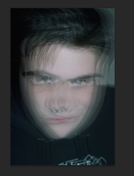
Colour balance changed too…

As I feel like this is not the best representation of my Lucid film, I have used Youtube to help me find different ways to edit the picture that me it look trippy and abstract
Here are two tutorials that I have followed and that have helped me a lot
