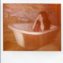
For my magazine, I have chosen an image which I took earlier on in the year at a festival, 
My reasons are:
- The main character is in my picture
- It shows an element of unrealism
- In photoshop I will make sure that I change the effects so the picture looks as though its an old polaroid photograph, I have done some research on this and have seen that Polaroid pictures are often taken to make something look old and scary.
- This image is perfect for my poster and for the film ‘Lucid’ because it shows Josh (Jack) looking confused, and as if the picture is looking into Josh’s mind.
- The characters dressed up also look fake and unrealistic, portraying an element of a dreamy world, which reflects my overal idea of the film Lucid
- Another reason is that the picture does not give everything away, its not a typically scary photograph, that would be used for a horror magazine, I chose to do something original altogether, this is because it does not reveal all about the movie, it could make people intrigued.
I typed ‘scary polaroid pictures’ into google, and here is what I found:
Also researched other horror magazines:
https://www.google.co.uk/search?q=horror+magazine&safe=active&source=lnms&tbm=isch&sa=X&ei=EhdqVP_cHdXbasPrgqgP&ved=0CAgQ_AUoAQ&biw=1247&bih=824
MAGAZINE:
I added and extra layer behind the photograph to make the picture look as though its a polaroid picture, I also edited the picture to be really bright, as if the picture had been taken by a polaroid camera, by turning the brightness up and making the colour balance stronger. I have also done this to make the picture more tippy as Josh thinks that what he’s doing is not real.
I’ve added a new layer and named my magazine ‘Hysteria’, I will research other fonts to use for my magazine as I’m not so sure that this font is perfectly fitted to my magazine. The colour of the font is perfect as I have used one of the icons and clicked on the woman’s skirt to get the same colour, it therefore matches the rest of the magazine.
I asked my friend on facebook what font she thinks I should use and she replied with:
The one your originally chose because it has a scary horror element to it, which is important because is a horror magazine.
After the title I added another layer and made a small circular icon, to make the piece of work look more like a magazine, i also added a glow effect too:
Next I added more text boxes around the magazaine, to make it more realistic and like a magazine:
My overal magazine cover:
This magazine will help the marketing aspects of my horror trailer.


[…] Trailer Poster Magazine […]
[…] Trailer Poster Magazine […]