Monthly Archives: November 2014

Final draft and construction of horror magazine (following on from the previous drafts)

da fontScreen Shot 2015-03-18 at 14.55.16Screen Shot 2015-03-18 at 14.55.24Screen Shot 2015-03-18 at 14.55.35

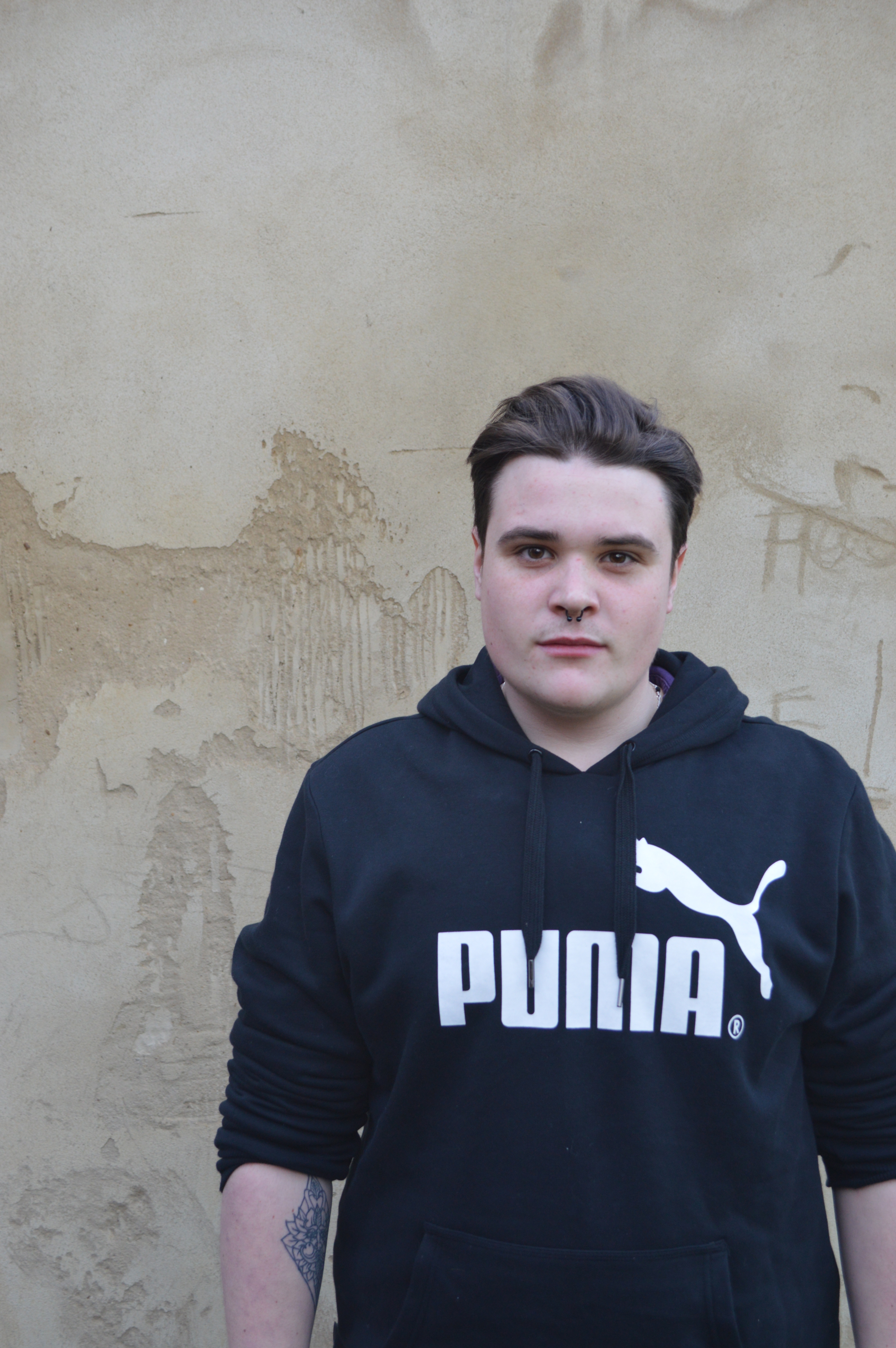
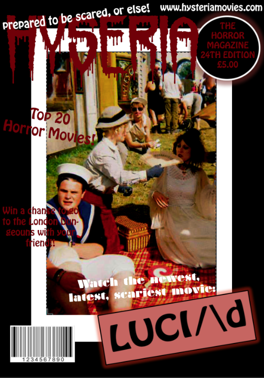
  • In order to find a fond that was best fitted to the theme of my horror magazine I went onto da font.com to search high hand low for a good enough font after much deliberation I chose a font called ‘Shaun of the dead’. As it was a convention to have a horror themed font I felt like this was the most fitting font to make my magazine look more realistic.
  • I drew a text box by clicking on the ‘T’ option on the left hand side of photoshop and dragged the text box across the top of the magazine picture.

Screen Shot 2015-03-18 at 14.55.29 Screen Shot 2015-03-18 at 14.55.35 Screen Shot 2015-03-18 at 14.55.42 Screen Shot 2015-03-18 at 14.55.47 Screen Shot 2015-03-18 at 14.55.53

  • To add in other conventions to make my magazine look more realistic so that my film would be well marketed, I used a different font called ‘Nervous’ which was also found on dafont.com and drew individual text boxes and wrote ‘No1 alternative horror magazine’, when researching other magazines I found that magazines such as scream featured this on a few of their front pages
  • I also added the convention of making a web page for my horror magazine and wrote ‘www.hysteria.co.uk’. Again from my research I found that magazines such as Scream put their website on the front page of the magazine thus making my magazine look more realistic.

Screen Shot 2015-03-18 at 14.56.10

  • The convention of a bar code is added, in order to do this i downloaded the ‘barcode’ font from da font and simply drew another text box and typed random letters in, it then made this barcode.
  • I placed it in the right hand corner of the page.

Screen Shot 2015-03-18 at 14.56.34Screen Shot 2015-03-18 at 14.56.39

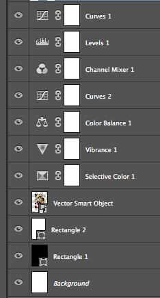
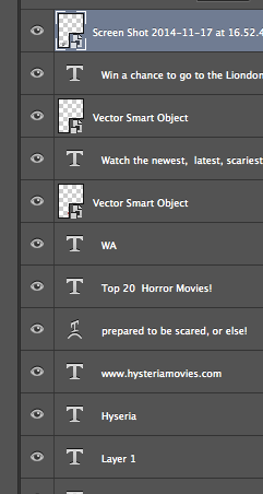
  • Individual text boxers were added to the front page, therefore I added another layer so I could work on each word individually so that i could move the words closer to one another as it makes the front cover look more professional if all of the words are aligned on the left hand side of the page.
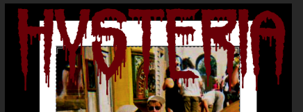
  • The font used here is ‘Stencil Std’ and I just found this in the font menu, as it fitted in with the rest of the aesthetic of my magazine I thought that it would make it looked more realistic and effective.

Screen Shot 2015-03-18 at 14.56.50Screen Shot 2015-03-18 at 15.03.58Screen Shot 2015-03-18 at 14.56.55Screen Shot 2015-03-18 at 14.57.48

Screen Shot 2015-03-18 at 14.58.08

  • In order to make sure that my film ‘Lucid’ featured on the front cover, in order to fulfil the conventions of horror magazines I made sure that I made the text of Lucid much bigger than the rest of the featuring text, therefore it made it stand out more which in return would capture the readers attention further… this is a good advertising technique which will further increase the excitement for the film
  • the font of Lucid is ‘sinister black’ and it was another font that i downloaded from da font
  • In order to make it stand out more, i added effects to it, I clicked on the layer of ‘Lucid’ and went to settings, and added a stroke around it and increased the width and changed the colour to white
  • Other effects were added such as ‘Bevel emboss, gradient overlay, pattern overlay and outer glow, this all added to the overall attraction of the main thing on the front.
  • Other text was added around the main feature of the movie, I clicked on another text box which made a layer and used the a previous font used called ‘nervous’ and typed ‘World exclusive’
  • In order to add more hype and attraction to the my movie I used a play on words to add to the front and placed it under Lucid, a text box was drawn and a previous font was used again called ‘Stencil std’ which makes the aesthetics of my magazine neater. I typed ‘HOLD THE HYSTERIA FOR THIS HOTLY ANTICIPATED HORROR’, the use of the play on words along with the title really engages the whole thing which is a good technique to engage the buyers more.The use of alliteration is also something that I added to make my magazine look more realistic as well.

Screen Shot 2015-03-18 at 14.57.22 Screen Shot 2015-03-18 at 14.57.31

  • I added another convention to make my magazine look more realistic
  • A shape called ‘Ellipse tool’ was drawn, I did this by clicking on the option as shown about and then dragged my mouse of the ellipses tool.
  • I then drew the circle and pressed apple shit t to resize the shape to fit on the magazine.
  • I placed it in the right hand corner and added more text inside it.
  • I drew 6 more text boxes and wrote ‘Jack Jordan Oscar Nominee Interview Special’
  • I filled the colour in yellow to make the interview special stand out
  • A previous font was used again called ‘stencil std’

Screen Shot 2015-03-18 at 14.57.53Screen Shot 2015-03-18 at 14.57.58

  • Another convention was added, from my research I found that a lot of horror magazines features a ‘more’ or ‘plus’ on the magazine to direct the consumers to the small print on the magazine to show them what else is features in the magazine, in order to make my magazine look more realistic i did this too.
  • I created a text box and used a previous font of ‘nervous’ and typed ‘more’
  • I then added another text box and aligned it underneath the ‘more’ and decreased the font size to make is look as though it is small print too,
  • I then typed ‘Top 20 scariest movie, books, movies, photography, talk zombies with Micheal Grey and Stacey Webber, interviews with up and coming directors too!
  • The font was changed to the colour of white as it made it stand out more.

Screen Shot 2015-03-18 at 14.58.12 Screen Shot 2015-03-18 at 14.58.27 Screen Shot 2015-03-18 at 14.58.35

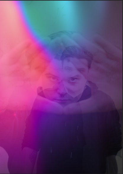
  • Next in order to add more a horror element to the horror magazine (because after all it is a horror magazine) I went onto Brusheasy to see if they had any blood brushes and they did, so i downloaded them from the internet.
  • Then I clicked on the brush tool in Photoshop and scrolled down to the bottom of the list as shown above and clicked on the recently added brushes.
  • Afterwards I used the brush and clicked once or twice around the text of ‘Behind the scenes of rings’
  • I did this again to ‘world exclusive’ as it made it stand out more
  • Also the blood is purposefully placed over his hands to symbolises that he has ‘blood on his hands’ which foreshadows to the consumers that there will be blood and gore in the film.
  • This links in with my horror trailer and poster as the use of fake blood is shown at the end of my trailer.

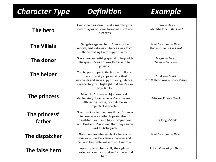
However, I had a dilemma when creating my magazine, I made two versions of the magazine and here they are:

As I did not know which one to choose, I left it to the public to decide, therefore I put both files next to one another and took a screen shot, i then uploaded the picture of them onto Facebook to get some responses and research which one the public liked best……

Screen Shot 2015-03-18 at 14.29.30

Here are my responses:

Screen Shot 2015-03-18 at 16.18.43

Screen Shot 2015-03-18 at 15.16.26

Screen Shot 2015-03-18 at 16.20.42

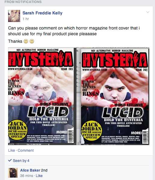
Overall, the majority apart from 1 person chose the right option as people said that it ‘popped more’ therefore I am using this one as my final piece for my magazine…..

Screen Shot 2015-03-18 at 15.04.38

2nd draft of horror poster

Screen Shot 2015-03-18 at 14.44.31 Screen Shot 2015-03-18 at 14.44.53 Screen Shot 2015-03-18 at 14.47.02

  • In the end I chose these three pictures to use and to mess around with for the front page of my magazine, however a problem with the images were that I forgot to tell my character to wear all black jumper so my only option was to either take the pictures again or to Photoshop the white out. As I liked the pictures the only option I had left was to use the erase tool and use the rest of the black on his jumper to replace the white bits on his jumper.
  • Also if i had left ‘Puma’ on his jumper it would have been illegal advertising as I did not get the rights to advertise puma in my magazine so here at the Photoshoped images without the puma (who would know hey):

Screen Shot 2015-03-18 at 14.47.11 Screen Shot 2015-03-18 at 14.47.19 Screen Shot 2015-03-18 at 14.47.32Screen Shot 2015-03-04 at 14.54.00

  • I started to layer my images on top of one another and each image i would turn the opacity down, I did this because it will fit in with the theme of my poster and replicates a psychedelic/trippy, the different pictures of Josh on my magazine also replicate how Josh has psychosis and has different personalities:

Screen Shot 2015-03-02 at 10.15.03Screen Shot 2015-03-02 at 10.15.10

  • Afterwards, in order to experiment with the psychological element of my trailer I researched ‘psychedelic filters that I can put over my images in photoshop’ and this Webstie came up http://blog.echoenduring.com/2010/01/20/10-photoshop-filters-you-should-definitely-know
  • this website led me to a downloadable package of different images containing very colorful filters
  • I chose one of the images and put it over my background images in photoshop
  • This was done by simply opening another image and then dragging the image over the top of my magazine like so:

Screen Shot 2015-03-02 at 10.14.30Screen Shot 2015-03-11 at 13.47.05  Screen Shot 2015-03-09 at 10.18.58

  • Next I added the text to my magazine, however, as I felt that this was not very appropriate or fitting to a horror magazine I decided to stop here as it looked more like a music magazine and does not fit the horror genre.
  • I then removed the colorful filter and started again.

Screen Shot 2015-03-11 at 15.15.25

Choosing the main picture for my horror magazine

In order to get a fair enough response and other opinion for which picture I should use for my magazine font cover, I have used survey monkey and created a poll including my 3 favorite pictures for the public to choose from…. here is the link to the survey:

Which photo should I use for my horror magazine front cover

DSC_0272 DSC_0273 DSC_0274 DSC_0275 DSC_0276 DSC_0277 DSC_0278 DSC_0279 DSC_0280 DSC_0281 DSC_0282 DSC_0283

Here are the responses from the survey that I made for what picture I should use as my main picture on my magazine front cover:

Out of the 12 pictures I chose these thee as my favourite pictures:

Screen Shot 2015-03-18 at 14.47.11 Screen Shot 2015-03-18 at 14.47.02 Screen Shot 2015-03-18 at 14.44.31

Here are the responses:

Screen Shot 2015-03-18 at 16.08.01

From this survey I can see that out of the 31 responses that I have received, this picture received the most responses;  67.74% out of 100% chose this picture:

Screen Shot 2015-03-18 at 14.44.31

Therefore I will use this picture as my main one for when I create my magazine

Planning my magazine publisher

The things that will dictate my magazine publisher:

  • my target audience
  • my gender
  • my age
  • and general fears that a lot of people share

All of these things will be taken into account when choosing the publisher of my magazine publisher

Screen Shot 2015-01-12 at 16.28.18

After researching different publishing agencies I am not entirely sure on who to choose to publish my magazine. I want to make sure that my magazine has the best possible coverage so that my whole age group of my target audience are able to have access to it. After looking at Future Plc, I found out that Future Plc publishes Total Film magazine and Bauer Media which publishes Empire magazine. Empire magazine is the main competition for my magazine because they are the biggest film magazine available in the UK and therefore if i went with Future Plc the competition against my own magazine would be extortionate and this would not be very good publicity for my own horror film. Therefore I have chosen a not so well known publishing agency: ‘Image Publishing’; http://www.imagine-publishing.co.uk/portfolio/magazines

As i’ve seen on the website they have different magazine categories and film is not one of them, therefore it will stand out. There is a wide-rang of magazines published by Image Publishing such as a game magazine, a photoshop magazine, and as my target audience is from 18-35 those who read the other published magazines would be intrigued to also read mine.

Drafting my Horror Magazine

For my magazine, I have chosen an image which I took earlier on in the year at a festival, realityvsdream

My reasons are:

  • The main character is in my picture
  • It shows an element of unrealism
  • In photoshop I will make sure that I change the effects so the picture looks as though its an old polaroid photograph, I have done some research on this and have seen that Polaroid pictures are often taken to make something look old and scary.
  • This image is perfect for my poster and for the film ‘Lucid’ because it shows Josh (Jack) looking confused, and as if the picture is looking into Josh’s mind.
  • The characters dressed up also look fake and unrealistic, portraying an element of a dreamy world, which reflects my overal idea of the film Lucid
  • Another reason is that the picture does not give everything away, its not a typically scary photograph, that would be used for a horror magazine, I chose to do something original altogether, this is because it does not reveal all about the movie, it could make people intrigued.

I typed ‘scary polaroid pictures’ into google, and here is what I found:

Screen Shot 2014-11-17 at 15.35.11Screen Shot 2014-11-17 at 15.21.39Screen Shot 2014-11-17 at 15.21.31Screen Shot 2014-11-17 at 15.21.20

Also researched other horror magazines:

https://www.google.co.uk/search?q=horror+magazine&safe=active&source=lnms&tbm=isch&sa=X&ei=EhdqVP_cHdXbasPrgqgP&ved=0CAgQ_AUoAQ&biw=1247&bih=824 

MAGAZINE:

Screen Shot 2014-11-17 at 15.41.36

I added and extra layer behind the photograph to make the picture look as though its a polaroid picture, I also edited the picture to be really bright, as if the picture had been taken by a polaroid camera, by turning the brightness up and making the colour balance stronger. I have also done this to make the picture more tippy as Josh thinks that what he’s doing is not real.

Screen Shot 2014-11-17 at 15.42.19

I’ve added a new layer and named my magazine ‘Hysteria’, I will research other fonts to use for my magazine as I’m not so sure that this font is perfectly fitted to my magazine. The colour of the font is perfect as I have used one of the icons and clicked on the woman’s skirt to get the same colour, it therefore matches the rest of the magazine.

Screen Shot 2014-11-17 at 15.52.40

This is the icon that I used: Screen Shot 2014-11-17 at 15.54.39

I asked my friend on facebook what font she thinks I should use and she replied with:Screen Shot 2014-11-17 at 16.00.06


The one your originally chose because it has a scary horror element to it, which is important because is a horror magazine.

After the title I added another layer and made a small circular icon, to make the piece of work look more like a magazine, i also added a glow effect too:

Screen Shot 2014-11-17 at 16.21.53

Next I added more text boxes around the magazaine, to make it more realistic and like a magazine:

Screen Shot 2014-11-17 at 16.54.01

My overal magazine cover:

Screen Shot 2014-11-17 at 16.56.44

This magazine will help the marketing aspects of my horror trailer.

|Final Story|

A normal teenager, with a normal name and face is about to embark on a very deep and dark adventure with his mind. He doesn’t understand whats real or not, this dangers himself and others around him, as we see the journey he endures, the madness is what comes next, inhumane and a callous story of Josh’s escapade, what could go wrong, he tells himself? Is it a dream or is it real life? Do you have dreams? What are your dreams? Have you ever wondered why some dreams are so vivid? Josh an average student waiting to lose his virginity, to go to the pub and have a laugh with his mates. Until something starts to control him, molesters his brain.

His dreams become reality, as perspective melts away, where will he hide when his nightmare catches up with him?

Prop List for my trailer

Costume:

  • black jeans
  • t-shirt
  • trainers

Props

  • Pint of beer
  • Chair
  • Stairs
  • A Bed
  • Window
  • Fake blood
  • Children’s toy

Locations needed

  • A pub
  • A house
  • A bedroom
  • A room with window
  • A long corridor
  • a woods -> Cornwall

Other characters needed

  • Barman
  • Person behind camera asking ‘are you ok’, (this will be me, as i will will be holding the camera)

I will use this image found: Propps Character types, to help me in the construction of my trailer:

propps character types